Are we a tad obsessive about the Jays' new uniforms? Just a tad. A smidgeon more than a tad.
Time is at a premium, so let us walk you through what we've picked out from the teaser video above, posted on the Blue Jays' site today.
 First out of the gate, at 0:01 in, we see Ricky Romero in a blue (BLUE!) jersey, which appears to a light blue. It could be that the flashing strobe effect here has made a royal blue look lighter than it is, but we at least figure that the alternates will be something other than black. Which was probably a given, but a relief nonetheless.
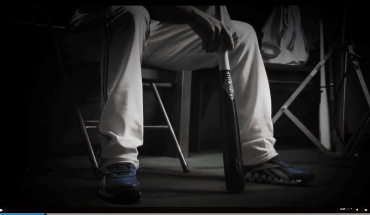 A mere second later, we get a view of what we initially thought to be José Bautista, but we now figure to be Adam Lind, as he is the only Jay who wears Reeboks. (And yes, we notice such things. Also, the Hickory bat.) It's hard to tell because of the dark lighting, but it appears as though the pant striping has two tones of blue divided by a white stripe, which is pretty much exactly the same as the 1991-1996 iteration. Also, blue shoes. Yay.
 We're not certain whose arms these are, but you can once again see the striping on the cuffs. From this shot, it appears as though both blue stripes on the cuffs are the same tone, which makes us wonder if we're seeing double-blue on the pants where there is none. Again, a fleeting dark look, so hard to tell.
 Skip ahead a bit, and you can see the new nameplate lettering on Adam Lind's back. This appears to be a standard block lettering, which we likely would have expected anyways given the goofy bubbly font that they are replacing.
 Okay, a quick couple of shots of Bautista, which give you a much clearer sense of how blue the Blue Jays will be. This appears to be exactly the same colour as the classic Jays look. And then...
 Boom! There's the new logo font, with a sharp serif coming off the "T" in "Toronto". (A sincere blue cap tip to Chris Creamer for pointing this out on Twitter.) We're not sure that we're crazy about the serif font, but we'll reserve judgment until we see the final product. In any case, there will be a newish look across the team's chest next season, and not just the old font recycled.
And if you're learned nothing else this afternoon, you should have learned that 1) we have have dodgy photo editing skills and 2) we're a little too enthusiastic about this rebrand. But then again, we've never claimed to be all that objective when it comes to the home team.
Above all, we're a fan.
18 comments:
Legit excited for Friday, y'all.
(Also, love the Zaprudering, Tao)
I think it was Davidi who posted this on Twitter yesterday, but now that we've caught a glimpse of the actual uniform lettering it seems like it's probably true: the font on the invitations might just be the same as the font on the shirts.
http://www.sportsnet.ca/baseball/2011/11/08/jays_invite640_640.jpg
Yeah, I was hoping it wasn't, because I'm not crazy about the font. Hoping it looks better on the jerseys than it does on the invite.
Take this for what it's worth, but the still image of Romero on the Jays' home page seems to make the alternate look royal blue. I, personally, prefer this to the lighter blue, so hooray!
Friday can't come soon enough.
I can't wait to see this stuff!
Excellent work, Tao. I love how the video shows just enough to make us salivate in anticipation, but not enough to actually leak the logo or much of the font.
Is it Friday yet?
Very cool, but you can't take any of the colours presented as what we'll actually see, given the insane amount of colour-correction in that clip.
In fact, looking at the video again, I'm not sure all those clips are anything but old footage recycled with heavy colour correction. The serif on the T could just be the fold in the jersey making it appear that way.
Yeah, I get the sense that the colour of the cap that Lawrie is wearing in the clip is just not right, because they were colouring over an overexposed frame.
I do worry that the uniforms are going to be introduced, and there's going to be a bit of a "meh" reaction because they are not actually all that different from the old school version.
I'd bet that the shelf life on these (if they are as close as I think they are) will be fairly short. Probably two seasons before they add an element, four seasons before they are reworked.
Don't know about you guys, but I'm thankful that, so far, there aren't signs of Rogers Red all over this. Really looking forward to Friday's unveiling.
you can also see in the first frame of ricky ro...the bottom of the new logo, which looks like it will be the same as the one leaked recently
The only thing that sucks about the new getups is Lind being in one...
Yay! just in time for Christmas! what a lark!
blah blah
Blah? Is that you?
Blah.
Jet!
How about a new stadium.....(we so desperatly need) to go along with the new uni's
That would be the icing on the cake wouldn't it? I'm so tired of walking up those never ending concrete ramps. Though to be fair i like the Dome when i'm in the lower deck.
Post a Comment